If there is anybody out there who listened to "A Light In The Distance" before this, the first thing that probably strikes you is how different the band sounds on this 7". It was only released a mere two years prior, but at times it seems a completely different sound to the LP. Honestly, I don't think it is quite as good, but that is to be expected right? Two years is a long time for a band to grow and progress.
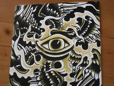
The artwork looks very Egyptian, what with the eye and winged shaped patterns and all. This made a lot of sense when I thought that Seraphim was an Egyptian god, but after some wikipedia-ing I'm not too sure if it really makes sense or not. Either way it's still pretty nice looking.
The same kind of pattern in continued inside the cover with the lyrics printed on top.I can't really remember what colour this was meant to be. I do know this was the second pressing of either dark purple or light pink and I'm leaning towards the light pink, but the colours can sometimes be a bit off can't they?


No comments:
Post a Comment